BetterConsult

UI Design

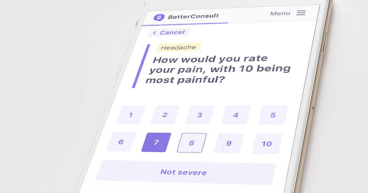
BetterConsult is a product from HealthShare enabling general practitioners to deliver more efficient outcome for their patients while saving precious time during their visit.

Initial statement

  • HealthShare's new product had everything to be created.
  • BetterConsult needed to be accessible for everyone since it is a medical app.
  • The UI had to be consistent with the rest of HealthShare's product branding.
  • Our communication materials had to speak to health specialists and be recognisable on stands during conferences.

Solution provided

  • Ensure contrast ratio and branding suitable for vision impairments.
  • Built an easy-to-use user experience.
  • Make sure icons are understandable and on brand.
  • Came up with a way of organising our Sketch files to ensure our different scenario were easy to understand to everyone.
  • Thanks to our design review process, we made sure that each UI component would be pixel perfect, matching our mesurement units in harmony with the other products.
bc landing page

Within the design team and my colleagues, I have been working on the User Experience as well as the UI for the app, including designing some icons for our own set.

BC icons list error pages

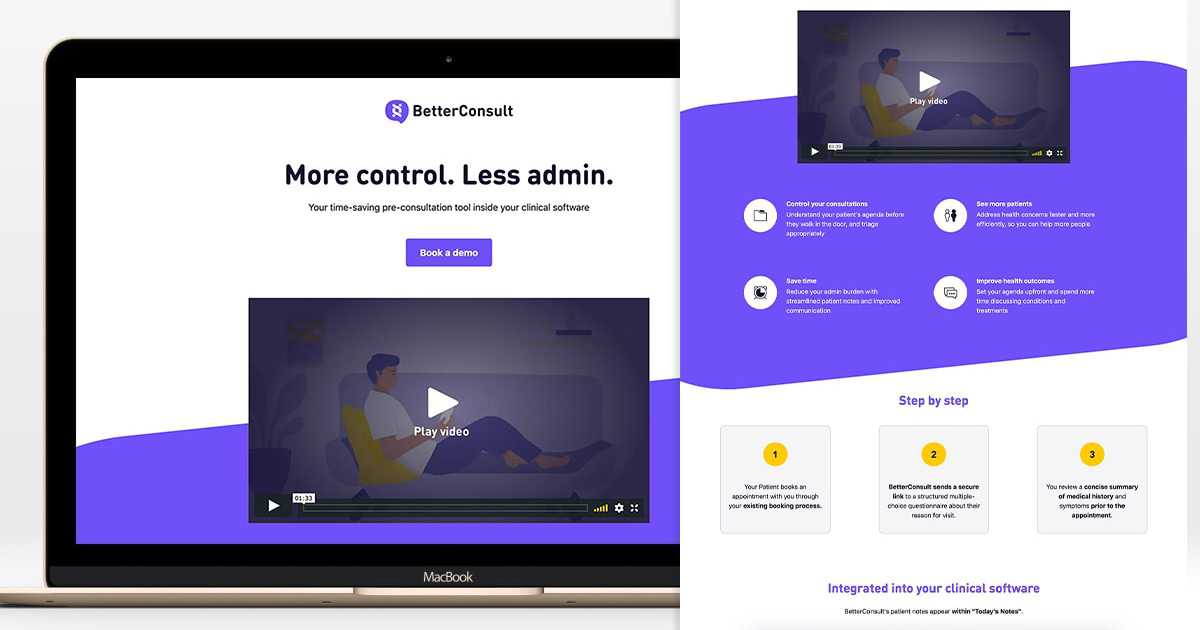
As my position at HealthShare evolved, along with the marketing team, we got tasked with ensuring clear communication for this new product.

flyers bc poster bc single bc flyer

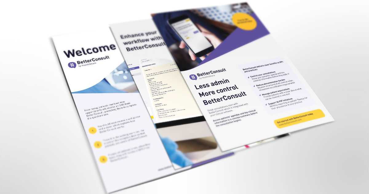
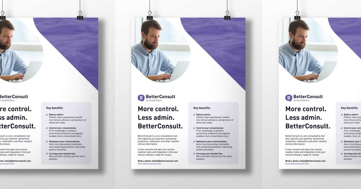
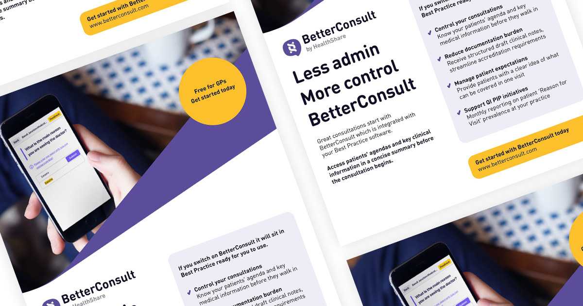
In order to complete this goal, I had the chance to do print campaign, web landing pages as well as short videos.

cover